SORRY IF NOT VISIBLE...


Step 4. Create a Second Copy of the Artwork at 150 DPI
Save a copy of your black and white artwork at 300 dpi. Set this aside – you’ll need it later. Then create a second copy of this artwork at 150 dpi. This is the file that we’re going to use for coloring. You will be coloring at this lower resolution because it’s easier on your computer.
Step 5. Create a “color” layer just under the artwork.
Your Photoshop layers should be set up like this:
Top Layer: Your Black and White Artwork. (set this layer to “multiply” so you can see the color behind your line art.)
Middle Layer: Blank Layer to be used for coloring (Also set to multiply)
Background Layer: White.
Step 6. Color your Artwork
The process of coloring is a very complex subject matter. I will not be able to go into all the details of coloring but here are a few tips.
First, fill the main shapes with a color that has a medium value (not to bright, not too dark – somewhere in the middle.) Then go back and add the shadows and bright spots off of this medium value color.
Switch to your artwork layer, use your Magic Wand to select an area on your artwork that you want to color, then switch back to your color layer to paint your color. In this way you can color carefree without fear of going "outside the lines."
It might be a good idea to do your solid colors on one layer, your shadows on another layer, and your highlights on another. And generally, keeping things on layers can save you grief in the long run in case you want to change things.
Have a general color strategy going into this process. I will often start with a fairly limited color pallet and work only from that. A lot of my coloring looks almost monochromatic because I use such a restricted color pallet. This is kind of like cheating, but I admit, I’m not the best colorist.
Also, you can use photographs in your coloring process to add texture.
Step 7. Delete the Artwork Layer, and Return the Color Layer to 300 dpi.
At this point your document should have only layers that with colors – no artwork. Next, return your image to 300dpi.
Step 8. Open Earlier 300 dpi Artwork and Paste it Above the Color Layer.
This is your original black and white artwork file that you saved at 300dpi and set aside. Select the artwork and paste it onto your color image. Set the new artwork layer that should be on top to “Multiply.”
Step 9. Flatten the Image and Save It.
This should be self explanatory. Your artwork is done! Congratulations.
Step 10. Import the Image into your Design Software.
I personally use Adobe Illustrator, I think it’s the best. But you can use Freehand or Corel Draw. Use the “place” function to import your artwork into your Illustrator file.
Step 11. Add Text and Graphics.
Add text and vector graphics onto your image as you would any photograph.
Step 12. Export the final design. That’s it you’re done!
I know that this tutorial did not go into all the details one could think of, but I wanted to give people a general understanding of the process of how we create our illustrated designs. We understand there are many aspects to drawing, illustration, and coloring. We could spend all day writing about the ins and outs of it.
Step 2. Ink your penciled artwork.
The second step is inking the drawing. These are the Tools you’ll need:
Paint Brush or Crow Quill Pen
I actually use a very small paintbrush (like a #1, #2 or #3).
India Ink
Some India inks are thicker than others. I like a nice thick India Ink. I have had success with Higgins Waterproof Black India Ink.
Marker
Any black waterproof marker should do.
More specifically, I use a regular #0 Windsor & Newton camel hair paint brush. I have also had great success with the new synthetic nylon or polyester fiber paint brushes. You will also notice I roll masking tape around the brush near the tip. I do this just to get a better grip of the brush. I feel like I have better control over the tip with this extra handle.
The large areas of black I fill in with a marker.
While you can ink with mechanical pens and markers I think it is important to use either crow-quill ink pens or paint brushes because it gives you the ability to vary the thickness of your lines. In some spots you’ll want to push down and create thick lines and then in others you’ll want to lift up to make very thin lines. Experiment with this to see what works.
A Couple Line Tips
First, you can create more depth in your drawing by doing this. Objects in your drawing that are closer to you should be drawn with thicker lines. Objects that are in the background should be drawn with thinner lines. This will create a sense of depth in your drawing.
Also – if there are bright spots – for instance a light source is behind an object, and the light source is just over your objects edge – the outline of this object might actually thin to the point where it stops, there is a gap, then the line starts up again.
After I dip my brush in the India ink sometimes there is too much ink on it, so I will tap it on the ink well, or draw a few lines on a scrap of paper before I go to my drawing.
It is also important that you are using the right paper. India ink will spread like crazy on some papers. Get a few varieties of Bristol paper and experiment. I find that a thick smooth or plate finish Bristol is the best.
If you have large areas that you need to “fill” I suggest using a black waterproof marker.
Once you’re done inking your drawing I usually wait for at least an hour before I go back and erase my pencil lines. I will use the same plastic eraser and just run it over the entire drawing. If your ink is not dry it will smear, so give it plenty of time. Once the ink is dry you should be able to safely erase the entire paper and the pencil will disappear and the ink will stay.
Step 3. Scan your Artwork at 300 DPI
Once your black and white artwork is complete – you’ll have to get it into your computer for coloring.
Tools You’ll need:
Computer
From here on out you’ll be working on a computer. I recommend a powerful design station, but obviously you’ll have to work with whatever is available. If your art is small a simple computer should be fine. But if you are working at a very large scale – you’ll need processing power to handle the size of the file.
Scanner
I really wish I had a large format scanner. That would like my life much easier. But I only have an 8.5×14 inch scanner. This typically means that I need to scan my artwork in pieces and stitch them together. This can be a bit of a pain in the butt.
Adobe Photoshop or Corel Painter
I personally use Adobe Photoshop but I think Painter is probably better. I use Photoshop because that is what I learned on and am most familiar with.
With the right tools in place, all that is left over is to stitch your artwork together. Since I frequently have to scan my artwork in pieces, since it’s too big for my scanner, I recommend that you use these tips:
Once you have your black and white image scanned into the computer and stitched into one piece of art you’ll need to resize the image to the final size you’ll want your artwork. On this art we’re going to make a 4" x 9" flyer. So, we will shrink the artwork to 4" across then add extra canvas so that our final art size is 4" x 9".
Once you have your black and white image scanned into the computer and stitched into one piece of art you’ll need to resize the image to the final size you’ll want your artwork. On this art we’re going to make a 4”x9” flyer. So, we will shrink the artwork to 4” across then add extra canvas so that our final art size is 4”x9”.
Note
If you’re going to be adding graphics and text above or below your artwork – you may want to take a moment and sketch out how you’re going to layout your graphics now. If, for instance, you want to add a text title above your illustration – how much space are you going to need? This way, you’ll have plenty of background art for use once you get onto the designing phase.
Here is the final scanned art:
Before I go into an insane amount of details I want to give you a quick snap-shot of the process:
The following sections will take through the above steps. Hopefully by the end of this tutorial you have a good idea of how to create your own comic book style.
Step 1. Draw with Pencil on Paper
The very first step is the pencil drawing. I could write a novel about how to draw, but this tutorial will focus on the process – the steps it takes – to go from pencil drawing to the finished, designed, commercial piece of artwork.
The following are the tools you will need:
Paper
I use a plate finish Bristol. This type of paper is heavy enough to handle a lot of erasing. It is also thick enough to not wrinkle when you are in the inking phase of this process.
Pencil
I actually use a mechanical pencil like the KOH-I-NOOR Technigraph 5611 Lead Holder. This type of mechanical pencil holds a very thick piece of graphite that you sharpen and use similar to a real pencil, except it’s better.
Eraser
I use the Staedtler Mars Plastic eraser. And a Sanford Tuff Stuff eraser stick.
I think that it is important to stay fairly loose when you are in the pencil drawing phase. Start with basic shapes, keep your lines fairly light and when you start to see the shape you’re going after you can focus in and "tighten" up your drawing.
Here is a sample of a fairly loose pencil drawing:
Here is a close-up sample of a fairly tight pencil drawing:
A Word of Encouragement about Drawing
I think most illustrators are far too hard on themselves. They expect to sit down with one piece of paper and draw exactly what they have in their mind the very first time around. In my opinion this is nearly impossible. Drawing is a process that takes a long time. I like to make an analogy between a good batter in baseball and a good illustrator. A great batting average for the major leagues is “.300.” This batting average means that they get 3 hits out of ten, or get a hit 30 percent of the time. I think that this is a reasonable expectation for an artist to have as well. If I can get 3 decent drawings out of ten attempts – I feel fairly good about myself.
So, relax while you’re in your pencil drawing phase of this process. Get yourself a big stack of paper and get loose, draw lots and don’t be concerned about “bad” sketches – just toss them aside and start over.
Here is our finished tight pencil drawing:
ANOTHER PART I WILL UPLOAD TOMORROW ....
Scanlines are a common feature of web images nowadays. The effect replicates the kind of lines that appear on a TV, and can give a photograph a similar look and feel.
Creating Scanlines:
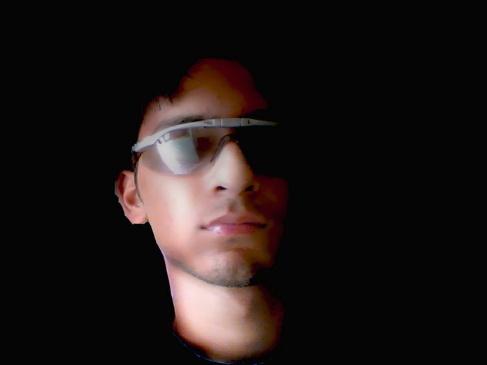
[ the photograph before any alteration ]

[ settings for the pattern image ]
[ The Pattern Dialogue Box ]
[ Select a pattern fill ]
[ adding the scanlines ]
The finished image should look something like this:
[ image with scanlines applied ]
Alright, now we are ready to begin this tutorial. Creating the perfect lines in Pixel Art are very important especially in the end product making sure that everything aligns correctly and matches up.
Here's How:
[ select the pencil tool with diameter 1 px ]
[ Above Fig 1.1: Left image zoomed in, right image what normal person will see ]
[ Above Fig 1.2: Left image zoomed in, right image what normal person will see ]
Tutorial Done:
Well if yours turned out similar to mine in the images, then you created your first pixel art lines perfect! These pixel art lines are the base for everything that you will create later on in your creation.