First of all, select your entire line drawing, making sure that there are no fills, just the lines, and copy it. Take it into Photoshop, and open a new document in RGB mode with a white background. I always add 20 pixels or so to the height and width generated by the computer so the image isn't pushed right against the edges. Place the image in the centre of the new document and OK it. The line art should now be on one layer, whilst the white background is on another.
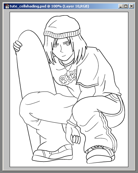 |
[ you'll be making something similar to what is shown above ]
Create a new layer in between these to - this is what we're going to colour on. There are basically two methods of doing this. For the larger areas, use the Magic Wand tool to select a section inside the lines layer.
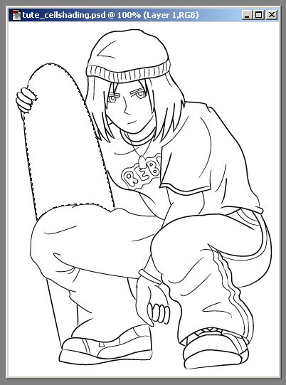
[ select an area with the Magic Wand ]
Without losing the selection, move down to the new empty layer. Use the colour picker to choose the shade you want, the Fill. Notice that because the lines layer is on top, you don't have to worry about going over the edge slightly. If the Wand has missed an area, then use the Brush tool to tidy it up, on around a 1 - 3 pixel setting.
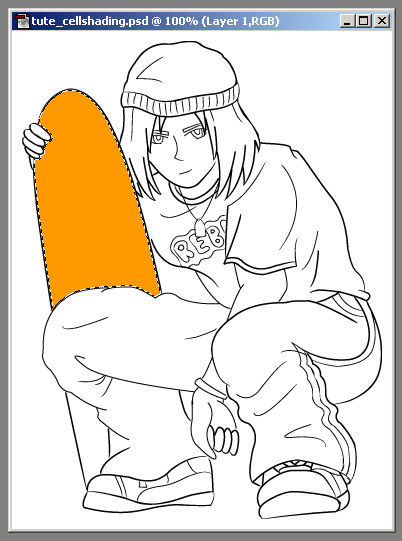
[ use the Fill tool to colour ]
At this stage, don't worry about shading your picture, just concentrate on building up the basic blocks of colour.
For smaller, more detailed sections, it's easier to use the Brush tool from the outset. Just make sure you colour in between the lines, using the top most layer as your guide. Once finished, you should have something looking like the image below.
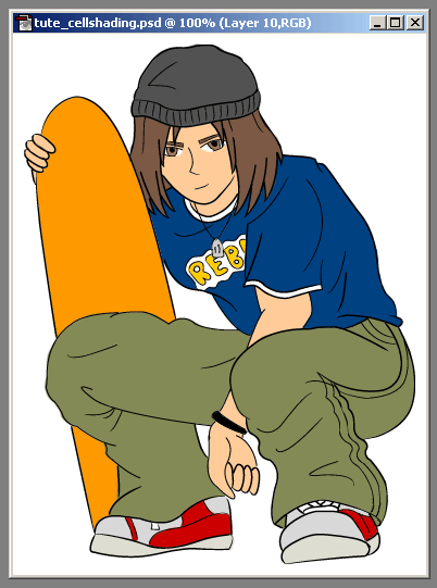
[ image with base colours filled ]
Now make a fourth layer, on top of the colours, but beneath the lines. This is where you will add the shading. To do this, use the Eyedropper tool to pick up the base colour of an area, then open the colour mixer. Select a tone that's darker than the original, then go back to your image. Use the Brush (on around 3 pixels) to gently add shadow. Use the lines as a guide - if you have drawn a fold in some clothing for example, then you will need to add shadow to this area. Pick a direction for a light source before you start shading, as this will help you work out where the shadows will be falling. If you included shadows on the original sketch, now would be a good time to refer back to it.
The hair is often a tricky area, because of the highlights, however there is a simple method for getting a good result. Add the shadows as normal, then make another layer on top (in case it doesn't work out right the first time). Pick up the base colour again, only this time choose a much lighter shade. Again with a small brush, carefully draw some areas of highlight. This usually follows a circular path round the head, although may vary depending on your drawing. Once in place, use the Smudge tool to smear the edges, blending it in with the base a little more.
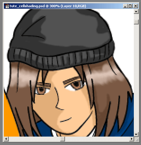
[ adding a highlight to the hair ]
Choose an even lighter colour, then add a very thin line with the Brush to the middle of the highlight. This should give the overall effect of light falling onto the hair. Merge this layer with the shadows layer when you are satisfied.

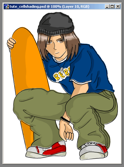
[ the finished image ]
That's pretty much all there is to it. Make sure that all the layers are visible and Save For Web. Keep a copy of the .psd file too, in case you wish to come back to it later.
A nice effect can be achieved by linking the two coloured layers and shifting them off by a couple of pixels. This slightly mis-aligns the fills, creating a more cartoon-ish look and feel.
[ image with fills out of alignment ]


No comments:
Post a Comment