Saturday, April 28, 2007

Creating Simple Fractals

The following is an example of something you will create before the end of this tutorial:

What is a Fractal?
The definition is: A mathematically generated pattern that is reproducible at any magnification or reduction.

However, in Photoshop, we do not need to use such complicated math functions to make a fractal, but just the Pen tool and Actions window.

Preparation:
So, let’s get started!

  1. First, open up Photoshop (6/7/CS2/etc).
  2. Now, create a new document with a white background and make the resolution something fairly large. For this tutorial I made mine 1600x1200.
  3. Now, that we have our new document lets make a new layer. We shall call this layer “Fractal”. Select this layer and then read on to the procedure.

Procedure:

  1. Select the paint brush tool and make sure that you have the size of the brush at 1px.

  1. Now select the pen tool and make sure that you click the paths button where it displays the options for the pen tool.
  2. This part gets tricky, so read carefully. Take the pen tool and draw any sort of path in the middle of the document (Fig 1):


Try not to make it too complex, but not too simple. Here is what mine looks like. Once you have finished with the path, hold ctrl + shift on your keyboard and select all the anchor points in the path you have just created. It should look something like this (Fig 2):

  1. Once you have done this, select your paint brush and then we can start using the actions palette to record our actions!
  2. Find the Actions window or go to Windows>Actions. Now, click the ‘create new action’ button.

  1. Once you have done this, name this action “Fractal 1”. Click record:

Alright, we are about half-way through now.
et's continue from where we left off:
  1. After Step vi, press Ctrl + t (transform):

  1. This should create a box around your path. Change the size too 101% of the path and make the rotate 1 on the transform toolbar at the top. Click, ‘confirm’ (the checkmark on the right).

  1. You are almost done, but not yet! Find the ‘Paths’ window or go to Windows>Paths. You should see your path there. Click the ‘stroke path with brush’ button.

  1. Once you have done that, you should notice that your path has been stroked with a 1px brush stroke.
  2. If all is good, you can now click ‘Stop recording’ from the actions window.

  1. On the actions window, click ‘Fractal 1’ and then click play.
  2. If successful, the actions will play and they will transform and stroke your path.
  3. This is the fun part. Click ‘play’ a bunch of times and you will notice that a bunch of lines are being created. If you do this enough, you can create some dazzling fractals:

  1. This is what my outcome was after like a million clicks

  1. Once you are finished and love the outcome of your fractal, you can go ahead and delete the work path.
  2. This is my outcome after duplicating the fractal (same as what you saw in the previous page) and rotating it:


Conclusion:
Well, I hope you liked this tutorial. Here are some tips you can use to make your fractals look better.

  • Incorporate the filter, Blur, after you record the stroke action. This will make your lines look more like gradients and less “liney”.

  • Change the amount of percent of size or rotation you record while using the transform tool.

  • Make a ton of these things because they are so fun to do!

If you have any questions, feel free to post them

Thursday, April 26, 2007

3-D Logos in Photoshop

Creating a 3-D Logo -
The following steps will explain how to create a 3-D logo using only Photoshop.

  1. Open Photoshop and start a new Image. Our example uses a canvas size of 320x320. You can make it any size you need, but I recommend starting fairly large to begin.

  2. Make a new layer by going to the main menu at the top, and select Layer/New Layer (or Ctrl+N). This will be the layer we put your logo on.

  3. Insert your logo in the middle of the canvas, making sure it's on the New Layer, and not on the Background Layer:

[ logo ready to go 3-D ]

Note
For the highlights to look correctly, it is important that you choose black as the color to start your logo. If you have a plain, black & white version of your logo, that would work best for this effect. Using black gives a more natural look to the highlights than starting out in your desired color.
  1. Once your logo is on the canvas and its own layer, go to the Main Menu and select Edit/Transform/Skew. Drag out the bottom corners to make your image look similar to this, and hit ENTER to accept the changes:

[ use free transform to skew the image ]

Note
You can also right-click on the logo itself and select Free Transform from the popup menu. Then right-click again to select the Skew option. This is a good shortcut a quite a few menus in Photoshop.
  1. Next, re-open the Free Transform Menu and select Scale to reduce the height of the logo a little. You want to squeeze it down to give it a little more perspective, and once we've done the next few steps, you'll get a better idea why. Make the image look like this one, and hit ENTER to accept the changes:

[ squeeze down the image ]

  1. Move your logo so it's in the middle of the canvas by dragging it with the Move Tool . Now your image should look similar to mine:

[ logo with some perspective ]

  1. Now it's time to add some dimension and shape to the logo, so we're going to add a slight emboss to it. On the Main Menu, choose Filter/Stylize/Emboss. Set the properties panel to something similar to this:

[ bevel and emboss settings ]

  1. After you apply the Emboss filter, your image should look similar to this one:

[ logo with bevel and emboss ]


  1. We're finally to the meat of the effect! The trick to this effect is so simple, and looks fantastic!

    Make sure the layer with your logo is selected. On your keyboard, hold Crtl+Alt, and then hit the UP arrow key. This a keyboard shortcut to duplicate layers easily. You can see the effect of your logo becoming 3-D right away! Make as many layers you think looks good. I duplicated the layer 10 times:

[ duplicating layers gives it a 3-D look ]

  1. If this is the colors you wanted for your logo, then you're done! Otherwise continue on so we can learn how to colorize it.

  2. Oh! you're still here....great! OK, time to colorize. We need to merge all of the duplicated layers you just created. Go to your layers panel and merge them down by selecting the top layer (the last one created) and hit Ctrl+E on your keyboard. Do this as many times needed to get your now 3-D logo on to one layer. Don't merge it all the way down, leave your background layer there.

Note
You can also go to the main menu and select Layer/Merge Down, starting with the top layer, however, keystrokes tend to be quicker than using the Main Menu.
  1. Now that the logo is on it's own layer, we want to give it some color, right? Of course we do. In the Layers Panel, select the layer with your now 3-D logo on it. Staying at the Layers Panel, hold Ctrl while you click a second time on the Layers panel. This will select and highlight your logo on the canvas:

[ selecting your logo to colorize it ]

  1. Make a new layer above the layer with your logo. Make sure the new layer is selected, and then choose the Paint Bucket Tool. Select the color you want, then fill in the empty layer within the selection.

  2. Go to the Layer Panel and change the layer type from Normal to Color.

Note
Coloring is pretty fun as well, and you'll find it's one of the more flexible parts of this technique. You could have started your image in any color, but using black gives a more natural look to the highlights then starting out in your desired color. Duplicating color layers can also increase the amount of color that shows through.
  1. If you need to, you can change your background color to whatever you want to match the logo.

  2. You can easily add drop shadows, glow effects, etc once you've gotten all the layers merged down to one. Here's the final graphic logo after adding a few other effects to the logo:

    [ final 3-D logo in photoshop ]

As you can see, doing 3-D in Photoshop is fun, and it's very easy to do. Once you've practiced this technique a few times, you'll see how quickly you can whip up a cool-looking 3-D logo. Most of the steps are flexible in that you can change the settings and attributes as you see fit for your work and design.


Here's a couple examples where I used this technique on real web sites:

Monday, April 23, 2007

Two Tone Bitmap Images

This is a nice and simple-to-apply effect for turning your images and pictures into a two tone bitmap style. Photographs generally work the best with this, and it's always helpful to have a picture that isn't too dark or too light. If it's leaning towards either end of the spectrum, you'll end up with a finished picture without many clear distinctions. More about that later.

Creating the image

  1. Open up the image you would like to manipulate, either in gif or jpg format. It doesn't particularly matter which one, just make sure you set the Mode to RGB if it isn't already. You can do this by clicking on Image in the toolbar, then Mode and RGB.

You'll also need the image on it's own layer, so cut and paste it into a new one.

[ starting image ]

  1. Using the Layers Panel, select the layer with the photograph on. At the bottom of this panel you will find a selection of filter and effects icons. From these, pick the fourth icon from the left (the one that looks like a black and white bisected circle), as indicated on the image below. This creates a new Fill or Adjustment layer over the top of the selected layer.

[ apply an adjustment layer ]

  1. A new pop up menu will appear, offering you a choice of layers to apply to the image. For this effect, choose the one second from the bottom - Threshold. Immediately you'll see a change in your image, as well as a new box with a sliding scale. Grab hold of the scaling arrow with the mouse, shift it along the bar and see what happens to your photograph.

[ threshold sliding scale ]

  1. The further you move the scale to the left, the lighter the picture becomes. By moving to the right, the image gets blacker and darker. This is why it is important not to have a too light or dark image in the first place, as Photoshop will have trouble separating the areas. A little playing around should give you an effect that you like, something similar to the picture below.

[ threshold applied to image ]

  1. Once you're happy you can merge the two layers and save it out. Want some colour? If you like, you can create a new layer above the merged one and block fill it with a colour of your choice. With the new layer highlighted, choose 'Multiply' from the drop down blending menu at the top of the Layers panel. Now your picture will look something like this.

[ adding some colour ]

And that's it! Try experimenting with different colours, pictures and blending modes to achieve new and interesting graphics.

Monday, April 16, 2007

Light Burst

Ever wanted to create those space warp/ light bursts that you see in banners and wallpapers all over the web? If you haven't, the following image is an example of such a graphic:

Now, I am sure you are interested in creating this effect. It's simple - here's how:

  1. Create a new document, any size, with a black background.
  2. Using the freehand lasso tool, draw a random, roughly round shape in the approximate centre of the image.


  1. Create a new layer, then fill this shape with white, using the Fill tool.


  1. Press Ctrl+D to de-select, and then open the Filter menu. Choose Blur>Gaussian Blur. Set the amount to 9 pixels and click OK.
  2. Now open the Filter menu again and choose Distort>Ripple. Set the amount to maximum and the size to medium. Click OK.
  3. Now press Ctrl + F twice, to repeat the filter twice.


  1. You should now have a nice ripply shape. This is the basis for your light burst.
  2. Open the Filter menu yet again, and choose Blur>Radial Blur. Set the amount to 100, the Type to Zoom and the Quality to Best. Click OK.
  3. Depending on the size of the image and the speed of your machine, the speed at which PS will process will vary. When it's finished, you should have a white light burst.
  4. You may notice some odd rings of noise around the burst. To fix this, apply a gaussian blur, experimenting with the amount.
  5. To make it a bit more interesting, try colorizing the burst (Ctrl+U, tick colorize, and play around), and maybe even adding a bit of lens flare.

That's it! Your image should look identical or similar to the image at the top of this tutorial. If you need any help, please post


THANKZZ

Saturday, April 14, 2007

Cell Shading Vector Art

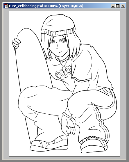
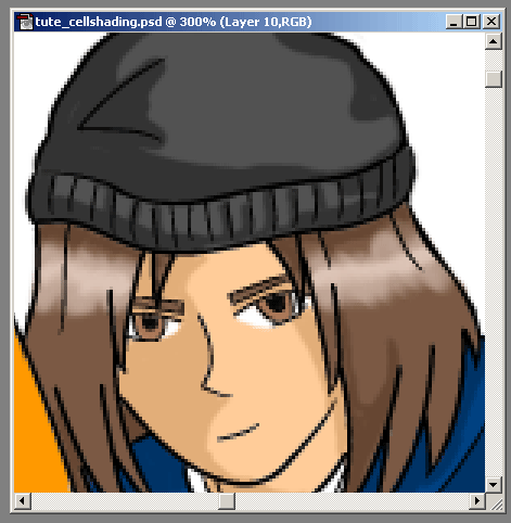
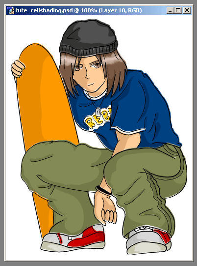
In this example, I've used a picture drawn in Adobe Illustrator. Whilst it is entirely possible to both draw and colour your artwork in this package, the technique being demonstrated here requires the use of Photoshop or an equivalent.

First of all, select your entire line drawing, making sure that there are no fills, just the lines, and copy it. Take it into Photoshop, and open a new document in RGB mode with a white background. I always add 20 pixels or so to the height and width generated by the computer so the image isn't pushed right against the edges. Place the image in the centre of the new document and OK it. The line art should now be on one layer, whilst the white background is on another.

[ you'll be making something similar to what is shown above ]

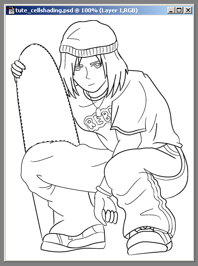
Create a new layer in between these to - this is what we're going to colour on. There are basically two methods of doing this. For the larger areas, use the Magic Wand tool to select a section inside the lines layer.

[ select an area with the Magic Wand ]

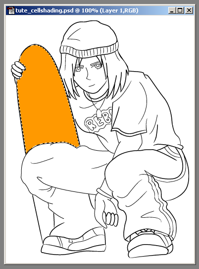
Without losing the selection, move down to the new empty layer. Use the colour picker to choose the shade you want, the Fill. Notice that because the lines layer is on top, you don't have to worry about going over the edge slightly. If the Wand has missed an area, then use the Brush tool to tidy it up, on around a 1 - 3 pixel setting.

[ use the Fill tool to colour ]

At this stage, don't worry about shading your picture, just concentrate on building up the basic blocks of colour.

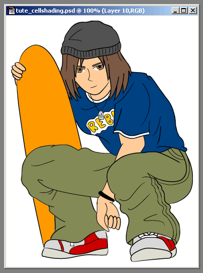
For smaller, more detailed sections, it's easier to use the Brush tool from the outset. Just make sure you colour in between the lines, using the top most layer as your guide. Once finished, you should have something looking like the image below.

[ image with base colours filled ]

Now make a fourth layer, on top of the colours, but beneath the lines. This is where you will add the shading. To do this, use the Eyedropper tool to pick up the base colour of an area, then open the colour mixer. Select a tone that's darker than the original, then go back to your image. Use the Brush (on around 3 pixels) to gently add shadow. Use the lines as a guide - if you have drawn a fold in some clothing for example, then you will need to add shadow to this area. Pick a direction for a light source before you start shading, as this will help you work out where the shadows will be falling. If you included shadows on the original sketch, now would be a good time to refer back to it.

The hair is often a tricky area, because of the highlights, however there is a simple method for getting a good result. Add the shadows as normal, then make another layer on top (in case it doesn't work out right the first time). Pick up the base colour again, only this time choose a much lighter shade. Again with a small brush, carefully draw some areas of highlight. This usually follows a circular path round the head, although may vary depending on your drawing. Once in place, use the Smudge tool to smear the edges, blending it in with the base a little more.

[ adding a highlight to the hair ]

Choose an even lighter colour, then add a very thin line with the Brush to the middle of the highlight. This should give the overall effect of light falling onto the hair. Merge this layer with the shadows layer when you are satisfied.

[ the finished image ]

That's pretty much all there is to it. Make sure that all the layers are visible and Save For Web. Keep a copy of the .psd file too, in case you wish to come back to it later.

A nice effect can be achieved by linking the two coloured layers and shifting them off by a couple of pixels. This slightly mis-aligns the fills, creating a more cartoon-ish look and feel.

[ image with fills out of alignment ]

Friday, April 13, 2007

Create a Glass Pill Button

Ever wondered how people got buttons looking like they were made of glass? Well this tutorial will take you through the process of how to create and edit buttons like that. Once you have finished this tutorial your button should look similar to this:

  1. Open up Adobe Photoshop and create a new page, for this tutorial I have gone for a 170 x 50 pixel page, but its up to you what size depending on how big you want your button to be.
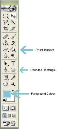
  2. Click on the 'Paint bucket' tool and set your foreground colour, and fill your page in with your desired colour. Next choose another foreground colour and select the 'Rounded Rectangle tool'. Now left click and drag on the page to create your shape.


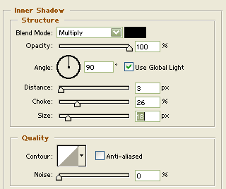
  1. Now its time to add the effects to your shape. Right click on the 'Shape layer' and select blending options and the layer style window should appear. Now select 'Inner Shadow' from the left hand column and put these settings in:

Now click on 'Inner Glow' from the left hand side column

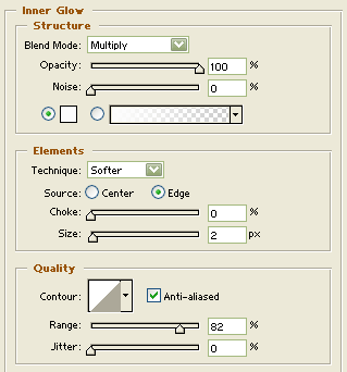
  1. While on the 'Inner Glow' section put these settings in:

Next click on 'Bevel and emboss' on the left hand column.

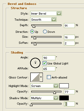
  1. While on the 'Bevel and emboss' section put these settings in:

After you have done that click on 'Contour' from the left (Nearly done Woohoo!)

  1. While on the 'Contour' section put these settings in

  1. Now press ok and your done :-)

If when you have finished your button you decide that the colours don’t look right, then you can adjust these by going to Layer > Change layer content > Hue & Saturation and ticking 'Colorize' and moving the bars to change colour.

Ta Da, now you have a spiffy looking glass button to add that extra bit of style to any bland website, but remember folks, don’t go overboard with it.